Difference Between Responsive and Adaptive Web Design
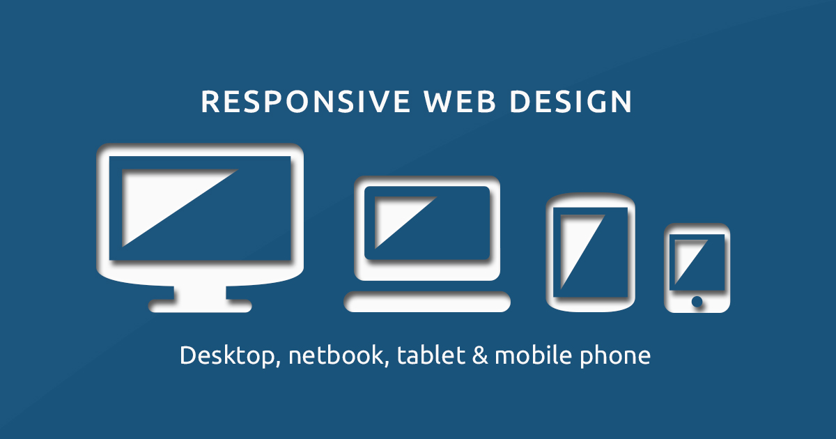
The aesthetics of a website plays a big role in making a website whole. Web design is an art. If you have ever renovated your home or did a solid makeover of your home, then you probably know there are strong parallels between doing a home décor and designing a website. A good website is about the relationship between the many elements involved and creating a balance between them. And a good web designer knows all the ins and outs of web design. The most intimidating part about web design is getting started because there’s literally a lot that goes into making a website both functional and aesthetically pleasing. One important aspect of designing a website is to make web pages adapt to the screens they are being opened on. The idea is to improve the browsing experience and make the website look good on all devices, whether it’s a smartphone, a tablet or a laptop.
What is Responsive Web Design?
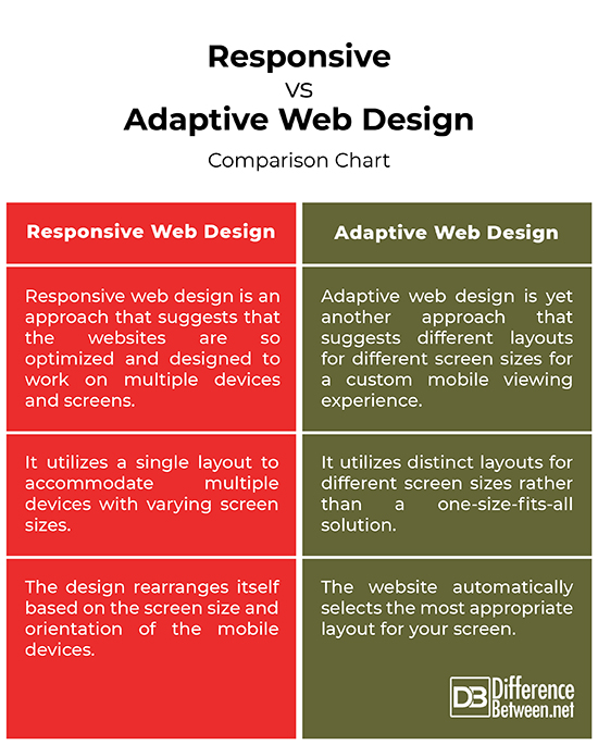
Previously, designers used to work on monitor screens, which varied in size but not that much. So, they had to make websites that could work on those monitor screens. But the increasing use of smartphones and other mobile devices have proved to be a major turning point for web design. Now, web designers had to optimize websites to work on those tiny little screens as well. Web designers started making mobile websites to optimize them for a better mobile viewing experience. But then mobile phones with varying screen sizes started flooding the market and designers couldn’t think of any viable option. Making separate websites for each one became a challenge. Responsive web design is the ultimate solution to this problem. Responsive web design is an approach that suggests that the websites are so optimized and designed to work on multiple devices and screens. The idea is to make websites so flexible that they should not rely on fixed screen sizes; in fact, they should be able to recognize the screen size and adapt to it providing a great viewing experience.

What is Adaptive Web Design?
Adaptive web design is yet another approach that suggests different layouts for different screen sizes to improve the mobile viewing experience. This is an era of mobile devices, the ones you can carry around with ease. In today’s digital age, mobile browsing has become the new norm so mobile devices cannot be ignored. The idea is to make the websites flexible so that web pages could adapt to the different screen sizes to accommodate different text sizes and window widths of the users. This allows for a custom mobile viewing experience similar to responsive web design, but instead of one-size-fits-all approach, adaptive web design utilizes distinct layouts for different screen sizes. For example, when you visit a website, it automatically selects the most appropriate layout for your screen. So, if you’re using a desktop, it chooses the right layout for your desktop screen and the same goes for your mobile devices.
Difference between Responsive and Adaptive Web Design
Approach
– While both responsive and adaptive web design approaches work toward the same goal; that is to make the websites flexible enough to provide the best mobile viewing experience regardless of the devices you are using. Responsive web design utilizes a single layout to accommodate multiple devices with varying screen sizes to provide an optimal viewing experience. Adaptive web design, on the other hand, utilizes distinct layouts for different screen sizes rather than a one-size-fits-all approach. The layouts depend on the different screen sizes, whether it’s a mobile phone, tablet or a desktop.
Maintenance
– Creating a responsive website requires both CSS and HTML, and occasionally JavaScript as well. Responsive design is quite a challenge because web pages need to be structured and tuned to work exclusively for certain devices. This would require a combination of flexible grids and layouts, images and smart use of HTML and CSS. And it’s also tough to make one size that fits all meaning one layout that will work in all available mobile devices. Adaptive design is relatively easier to achieve because creating different pages for different types of devices seem to be a viable alternative.
Flexibility
– Responsive design is fluid and flexible and adapts to the screen of the device you’re using. There is only one version of the website with all the content, but the design rearranges itself based on the screen size and orientation of the mobile device you’re using so that you do not have to zoom in or out to read the content on the screen. Adaptive design, one the other hand, is relatively less flexible because the mobile websites are always different than full-sized desktop websites, so web pages may not work on as many devices as their layouts are able to.
Responsive vs. Adaptive Web Design: Comparison Chart
Summary
In a nutshell, responsive web design is a safer approach because it always gets the job done regardless of the many screen sizes and the number of devices that just come and go. The websites are so optimized that the design rearranges itself based on the screen size and orientation of the mobile device you’re using, providing you the best mobile viewing experience. However, at times when you need different layouts for different devices for a custom mobile viewing experience, adaptive design is a better option. At the end of the day, it’s all about creating a website that meets your business goals and also fulfills users’ needs.
- Difference Between Serif and Sans Serif - April 22, 2024
- Difference Between HTML and Text - April 19, 2024
- Difference Between FTP and SFTP - April 16, 2024
Search DifferenceBetween.net :
 Email This Post
: If you like this article or our site. Please spread the word. Share it with your friends/family.
Email This Post
: If you like this article or our site. Please spread the word. Share it with your friends/family.
1 Comment
Leave a Response
References :
[0]Robbins, Jennifer Niederst. Web Design in a Nutshell: A Desktop Quick Reference. Massachusetts, United States: O'Reilly Media, 2006. Print
[1]Beaird, Jason. The Principles of Beautiful Web Design. Melbourne, Australia: SitePoint, 2010. Print
[2]Peterson, Clarissa. Learning Responsive Web Design: A Beginner's Guide. Massachusetts, United States: O'Reilly Media, 2014. Print
[3]Clark, Jason A. Responsive Web Design in Practice. Maryland, United States: Rowman & Littlefield, 2015. Print
[4]Gustafson, Aaron. Adaptive Web Design: Crafting Rich Experiences with Progressive Enhancement. Tennessee, United States: Easy Readers, LLC, 2011. Print
[5]Image credit: https://commons.wikimedia.org/wiki/File:Responsive-web-design-devices.jpg
[6]Image credit: https://image.freepik.com/free-vector/adaptive-responsive-web-design-different-electronic-devices_253610-2.jpg

you’re in point of fact a good webmaster. The web site
loading pace is amazing. It kind of feels that you
are doing any unique trick. Also, The contents are masterwork.
you’ve done a great job on this matter!