Difference Between Mobile First and Responsive
The web design and the development world have changed dramatically over the years. We have moved from traditional computing to mobile computing and this expectation of computing and working on the go calls for a new model for building a Web that could be mobile-friendly and support a growing number of mobile devices and operating systems. The responsive web design philosophy solves this problem by creating different aspects of the same unified design, which adapts to the screen size of whatever device you’re viewing it on, as opposed to the mobile-first web design, which as the name suggests, is a mobile-first approach to building websites or apps for the mobile platform.
What is Mobile First?
Mobile first, as the name suggests, is a web design paradigm that involves creating a website or application for the smaller screens first and then working your way up to larger screens. Mobile first has become the new normal these days as people are used to their small screens. The idea is to build a website or app using a mobile responsive framework and then tweak it for the bigger screen devices such as tables, desktops or laptops. It intends to create an immersive web viewing experience but instead of viewing the desktop versions on mobile devices, the designs are built specifically for the mobile devices. This strategy suggests companies should create websites or applications for the mobile devices first, and then move to the big screens in order to create a better user experience for the users on the go. Mobile first strategy ensures the user experience is seamless on any device starting with mobiles.
What is a Responsive Web Design?
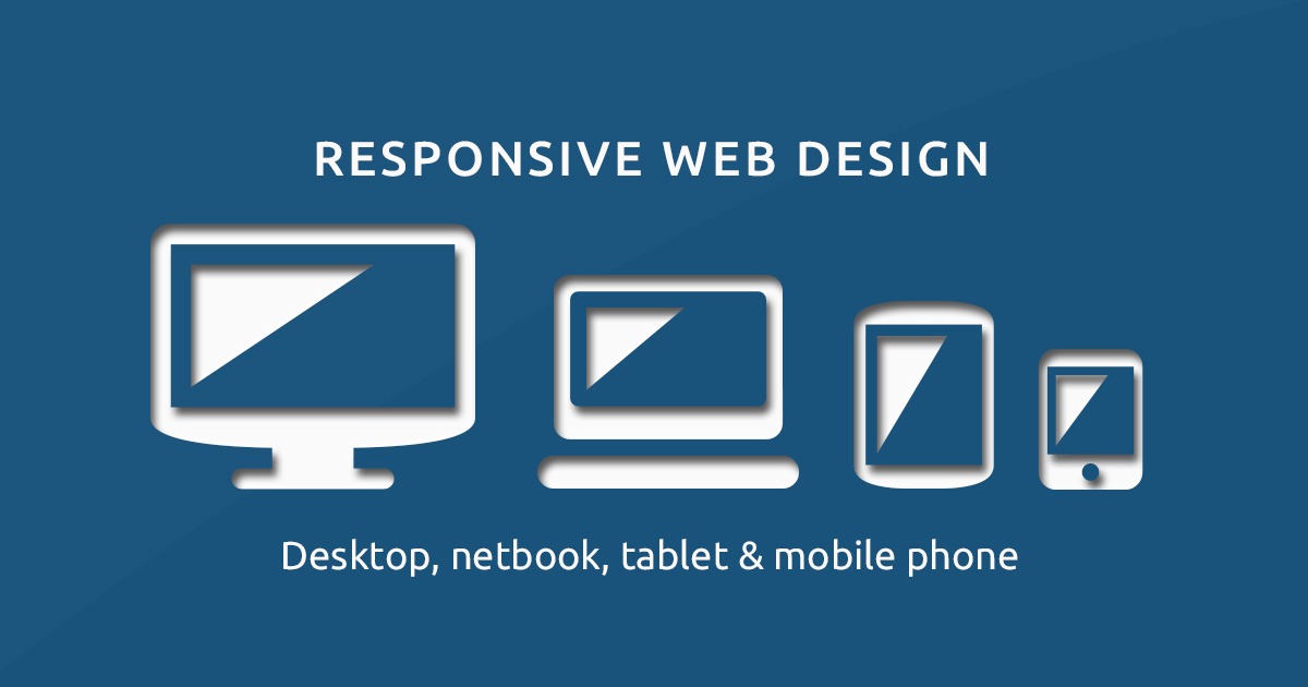
Responsive web design is a strategy or a set of strategies used to render web pages on a variety of devices or screen sizes, as opposed to building websites or applications for the mobile devices first. Responsive is a web design philosophy that is inclined toward traditional desktops and then tweaked for smaller screen devices. It is a practice of building a website or application that will automatically resize and adjust itself to the dimensions of the device you’re viewing it on. Responsive designs are tailored to provide an immersive web experience on normal sized desktops and large display screens. This allows the elements within a website or app to move around, change size and even change how they look, to best fit the device it is being viewed on. So, either the whole design or some specific elements of the website or application adapt to work well on just any device, any screen size or any combination of capabilities.
Difference between Mobile First and Responsive
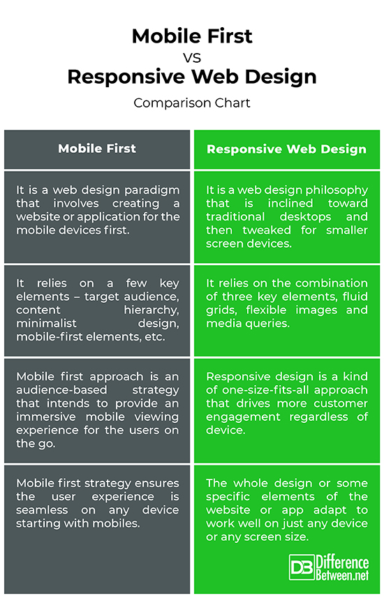
Design Philosophy
– Mobile first, as the name suggests, is a design approach to building a website or application using a mobile responsive framework for the smaller screens first, and then working toward the bigger screens or bigger devices. It is similar to creating a mobile app first and then adapting the layout to work on desktops, tablets, or laptops without too much tweaks. Responsive, on the contrary, is a web design approach that is inclined toward traditional desktops and then scaled down to work on the mobile devices providing the same immersive experience for the users regardless of the device.
Engagement
– Mobile first design approach is an audience-based strategy that intends to provide an immersive mobile viewing experience for the users on the go. Today, most of the people are using their smartphones for everything, from shopping online to book flight tickets, set reminders, find the nearby restaurant, almost everything. If you’re developing a social media plan and most of your targeted users are using Twitter, you’d focus more on creating Twitter content to drive engagement. Responsive design is a kind of one-size-fits-all approach that drives more customer engagement by making the content easily accessible on all devices rather than making it mobile-first.
Key Elements
– Mobile first approach aims to create the optimal user experience for the users on the go and at its core, it is all about minimalism and simplicity. Most of the internet users still want a better mobile viewing experience, so you’d want to put your target audience in mind before designing a website or application. Then comes the content and content is king when it comes to customer engagement. Other key elements include big navigation buttons, strong typography, relevant content, and so on. Responsive design approach aims to deliver an optimal user experience using HTML and CSS techniques such as fluid grids, flexible images, media queries, etc.
Mobile First vs. Responsive Web Design: Comparison Chart
Summary of Mobile First vs. Responsive Web Design
Mobile -first design approach is self-explanatory. It is everything what it says; a mobile-first design meaning the websites or applications are built for the mobile devices first and once done, it is then tweaked for the bigger screen devices like desktops, laptops or tablets. The idea is very simple – to create an immersive viewing experience for the people on the go, people who stick to their smartphones. Responsive approach, on the contrary, is more inclined toward desktop viewing and then redesigned for smaller screens or mobile devices. Responsive web design employs some techniques that enable either the whole design or some elements of your website or app to adapt to whatever screen size you’re viewing.
- Difference Between Pokémon Pearl and Diamond - February 16, 2026
- Difference Between Caucus and Primary - June 18, 2024
- Difference Between PPO and POS - May 30, 2024
Search DifferenceBetween.net :
 Email This Post
: If you like this article or our site. Please spread the word. Share it with your friends/family.
Email This Post
: If you like this article or our site. Please spread the word. Share it with your friends/family.
Leave a Response
References :
[0]Shenoy, Aravind. Learning Bulma: Understand How to Develop Responsive, Mobile-first Websites Using This Impressive, Modern Framework. New York, United States: Apress, 2019. Print
[1]Gonzalez, Jason. Mobile First Design with HTML5 and CSS3. Birmingham, United Kingdom: Packt Publishing, 2013. Print
[2]Clark, Jason A. Responsive Web Design in Practice. Maryland, United States: Rowman & Littlefield, 2015. Print
[3]León, Inayaili de. Moving to Responsive Web Design. New York, United States: Apress, 2016. Print
[4]Image credit: https://upload.wikimedia.org/wikipedia/commons/1/1f/Responsive-web-design-devices.jpg
[5]Image credit: https://www.seobility.net/en/wiki/images/3/3c/Mobile-version.png