The way content is organized on a website says a lot about you or your organization. Just the right content is not enough, but knowing how to organize your content is really very important. The layout of your website or your web application matters the most when you want to focus on the content. And it’s the responsibility of the Cascading Style Sheets to organize and show your content as elegantly as possible. Thankfully, we have two powerful CSS layout mechanisms at our disposal to do just that: CSS Flexbox and CSS Grid. But the question is when to use Flexbox and when to use Grid.
What is CSS Flexbox?
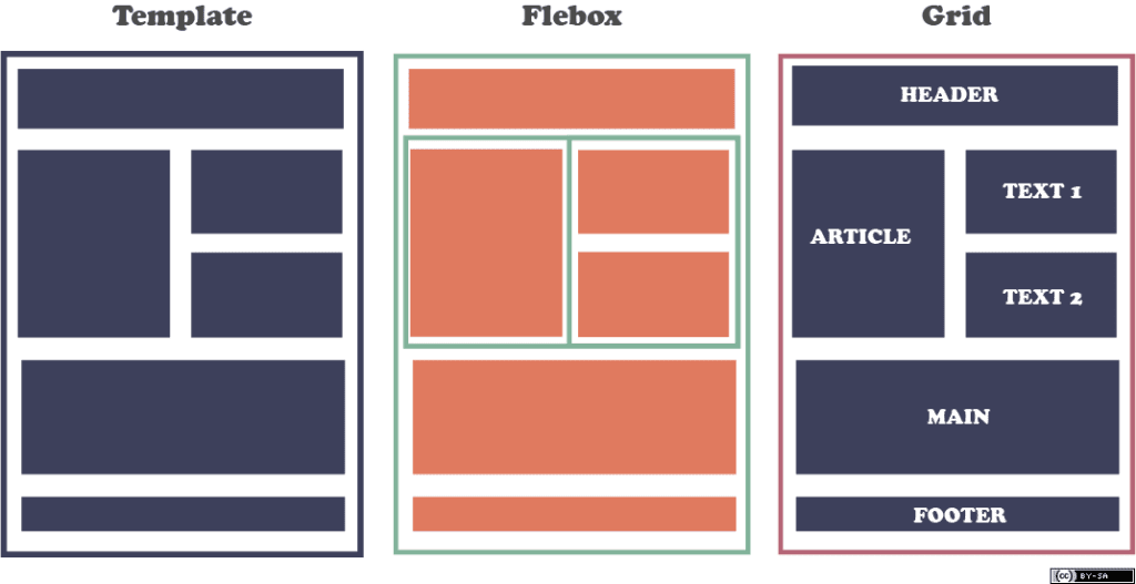
The Flexbox, short for the CSS Flexible Box Module, is a one-dimensional layout model within CSS that makes it simple to layout your page, application, widget, or gallery, or just any responsive feature your site requires. Thanks to Flexbox’s powerful aligning capabilities, you can easily create flexible responsive designs using float or positioning. Items flex to accommodate into extra spaces and shrink to fit into tight spaces. The Flexbox is basically a layout model that provides an easy and neat way to arrange items within a container. If you have a container with its display property set to flex, it flex the size of the containers within it but the containers’ margins do not collapse with the margins of its contents. It enables you to calculate and distribute space but without altering the underlying markup. There are no floats at all and it is responsive and mobile-friendly.
What is CSS Grid?
The CSS Grid Layout Module, or CSS Grid, is a powerful grid-based layout system in Cascading Style Sheets that makes it simple to design complex responsive web layouts across browsers using a two-dimensional grid. Web applications have become more complex over the years and developers needed something simple that could help them do advanced layouts without using any complex solutions such as using floats. The CSS Grid provides a unique solution to this problem, providing a flexible way to change the position of elements with only Cascading Style Sheets without even changing the HTML. It largely replaces the need to use any kind of float based layout or Flexbox or any of the stuff you used before. The idea behind CSS Grid is to divide a page into major regions while also allowing you to position and size the building block elements in terms of size, position and layer. It enables you to lay out items across and down at once, which is something a Flexbox container cannot facilitate.
Difference between CSS Flexbox and Grid
Layout
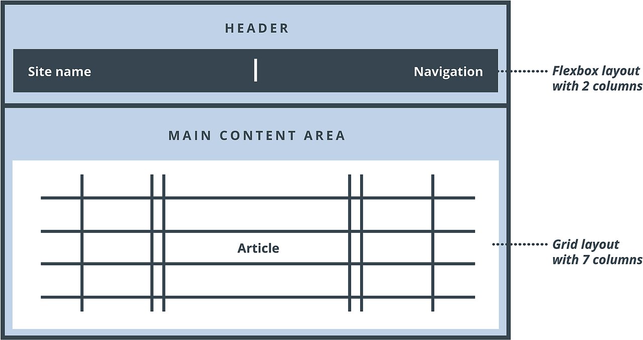
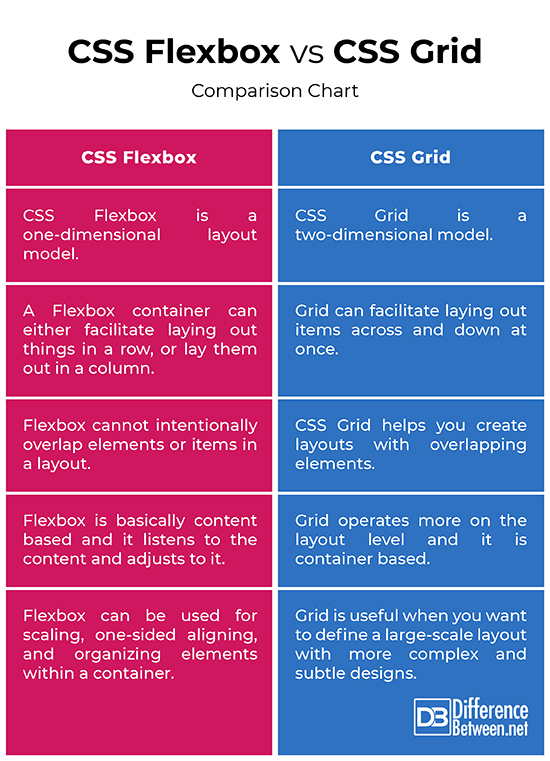
– The very first and the most important difference between the two layout modules is that CSS Flexbox is a one-dimensional layout model whereas CSS Grid is a two-dimensional model. By one-dimensional it means a Flexbox container can either facilitate laying out things in a row, or lay them out in a column.
The CSS Grid, on the other hand, can facilitate laying out items across and down at once, meaning you can work along two axes, vertically and horizontally, which the CSS Flexbox cannot do. Grid thinks about rows and columns at the same time.
Control
– CSS Flexbox helps you organize things horizontally in one direction or organize things vertically in one direction. The calculations are done in each row, one at a time with no regards to the other rows, and you can adjust justification and alignment controls inside each of these.
CSS Grid, on the other hand, gives you layout controls that work perfectly in two directions, which means it allows you to organize wherever you want inside of your grid cells.
Overlapping
– There are things that both Flexbox and Grid can do, meaning there are situations where they basically could do the same thing. But there is one thing Grid can do and the Flexbox cannot do is intentionally overlap items. For example, in magazine layouts you can see there are overlapping elements all the time. You can see layouts with little bits and little pieces overlapping other bits and other pieces.
CSS Grid helps you create layouts with overlapping elements to create interest or help you do some kind of an asymmetrical layout. This is something that is not possible with Flexbox.
Use Cases
– Flexbox is basically content based. It listens to the content and adjusts to it. Grid operates more on the layout level and it is container based, meaning it basically dictates the structure.
So, CSS Grid is useful when you want to define a large-scale layout, while CSS Flexbox can be used on a smaller scale for flexible elements.
Flexbox can be used for scaling, one-sided aligning, and organizing elements within a container. Grid can be used to create more complex and subtle design layouts, and when there is a gap between block elements.
CSS Flexbox vs. CSS Grid: Comparison Chart
Summary of CSS Flexbox vs. CSS Grid
The CSS Grid has been designed to do many things that Flexbox couldn’t do and Flexbox is still one of the best tools for the developers to do stuffs that Grid cannot do. Well, Grid does not handle layout for the whole page; in fact, it handles the layout for a particular container, one container on the page, and the items that are directly related to that container. Flexbox is actually great when you want to line things up in one direction. This means the calculations happen one line at a time and the browser can only process things in one dimension at a time. Grid has the ability to line things up in two directions. Grid has the power to change the order of the layout without altering the markup. Grid has some powerful features which changed the way we create layouts for the web.
- Difference Between Pokémon Pearl and Diamond - February 16, 2026
- Difference Between Caucus and Primary - June 18, 2024
- Difference Between PPO and POS - May 30, 2024