Difference Between CSS Grid and Bootstrap
CSS has come a long way since it was first proposed by Norwegian Håkon Wium Lie in 1994. CSS is now one of the three major cornerstones of modern-day web development, other two being HTML and JavaScript. From a simple language for formatting documents to a versatile tool for designing web applications, CSS has revolutionized the way we build websites and web applications. Its features set and abilities have grown over the years. Undoubtedly, the biggest gamechanger to CSS layout has been CSS Grid. Then came bootstrap which quickly became one of the best responsive, open-source front-end frameworks on the web. So, should you use CSS Grid or Bootstrap? Let’s take a look which one’s better.
What is CSS Grid?
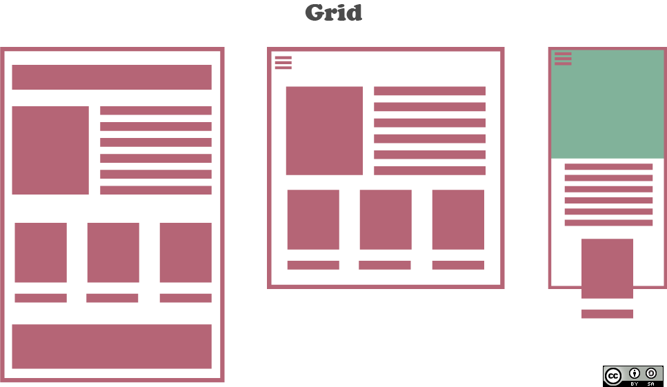
CSS Grid Layout Model, or simply called the CSS Grid, is a powerful layout system that uses a two-dimensional grid to define multiple areas of layout with only a handful of CSS rules. The Grid, without a doubt, is the biggest game-changer to CSS layout which is capable of doing everything you have done before with more predictability and less code. With Grid, you can do things you simply could not do before. Grid truly changed the way you design websites, providing a flexible way to change the position of elements with only CSS without even changing the HTML. With Grid, you can explicitly define the size and the number of rows and columns or you can let the browsers decide how many rows and columns are going to be. You can also place each item into a specific area or cell or you can let the browser decide where to put the items onto the grid using the auto-placement algorithm.
What is Bootstrap?
Bootstrap is the most popular open-source CSS framework designed to create and build modern websites and web applications. It uses a collection of HTML, JavaScript and CSS tools for faster and easier web development in the new standard of the mobile-first philosophy. It is a free front-end framework that is fast and easy to use, and it is sleek, intuitive and powerful. It uses HTML and CSS based design templates for typography, buttons, forms, tables, navigation, etc. Originally named Twitter Blueprint, Bootstrap was developed by two engineers, Jacob Thornton and Mark Otto, who previously worked for Twitter. Twitter released Bootstrap as an open-source project in 2011. Bootstrap offers an extensive set of built-in components, which are custom CSS classes specially used for specific purposes, such as breadcrumbs, alerts, progress bars, and navigation bars. The best part is, with just the knowledge of HTML and CSS, you can easily start with Bootstrap.
Difference Between CSS Grid and Bootstrap
Layout
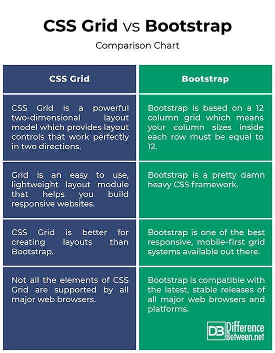
– CSS Grid is a powerful two-dimensional layout model which provides layout controls that work perfectly in two directions meaning you can work along two axes, horizontally and vertically. It allows you to lay out items across and down at once. Bootstrap, on the other hand, offers a twelve column system meaning the system is based on a 12 column grid. So, your column sizes inside each row must be equal to 12. It breaks after 12 and the rest of the columns are equally distributed. This makes the grid more flexible for a wide range of layouts.
Flexibility
– CSS Grid allows you to define columns and rows in your CSS without having the need to define them in markup. The implementation of this CSS standard gives you the ability to build page layouts with native CSS code without even worrying about changing the HTML. Bootstrap has ready-made built-in components that allow you to build a fancy web page in no time and it makes it easy to customize its look and feel to your liking. But, it uses a lot of extra CSS code that has of no relevant use in your projects. However, Bootstrap’s handy grid system makes it easy to build responsive web pages.
Features
– Bootstrap is a great prototyping tool which allows you to make working prototypes in no time with very little to no custom code. A huge number of websites still rely on Bootstrap for their front end. Bootstrap is compatible with the latest, stable releases of all major web browsers and platforms. In addition, it is one of the best responsive, mobile-first grid systems available out there. With CSS Grid, you can create grids of virtually infinite permutations and position child elements wherever you want, regardless of their source order. CSS Grid is better for creating layouts than Bootstrap and it makes HTML look cleaner because of its simplicity.
CSS Grid vs. Bootstrap: Comparison Chart
Summary of CSS Grid vs. Bootstrap
In a nutshell, if you’re making a plain, simple front-end site and you don’t care what the front-end really looks, then Bootstrap is great for you. And it is compatible with all the latest, major web browsers and platforms out there. A huge number of websites still rely on Bootstrap for their front end. Bootstrap is still a heavy contender in the front-end ecosystem and its biggest selling point – it is open source. CSS Grid is a powerful two-dimensional layout model that is better for creating layouts than Bootstrap and it makes HTML look cleaner and succinct. If you want to build a super custom layout that you’ll want to customize a lot, you’d better stick to CSS Grid.
- Difference Between Caucus and Primary - June 18, 2024
- Difference Between PPO and POS - May 30, 2024
- Difference Between RFID and NFC - May 28, 2024
Search DifferenceBetween.net :
 Email This Post
: If you like this article or our site. Please spread the word. Share it with your friends/family.
Email This Post
: If you like this article or our site. Please spread the word. Share it with your friends/family.
Leave a Response
References :
[0]Frain, Ben. Responsive Web Design with HTML5 and CSS. Birmingham, United Kingdom: Packt Publishing, 2020. Print
[1]Buckler, Craig et al. The Advanced CSS Collection. Melbourne, Australia: SitePoint, 2018. Print
[2]Bhaumik, Snig. Bootstrap Essentials. Birmingham, United Kingdom: Packt Publishing, 2015. Print
[3]Perna, Maria Antonietta et al. Learn Bootstrap: The Collection. Melbourne, Australia: SitePoint, 2018. Print
[4]Perna, Maria Antonietta et al. Your First Week With Bootstrap. Melbourne, Australia: SitePoint, 2018. Print
[5]Image credit: https://commons.wikimedia.org/wiki/File:Exemplos_de_CSS_Grid.png
[6]Image credit: https://commons.wikimedia.org/wiki/File:WMF_SPDPP_milestone_bootstrap.png